Complete Guide to Ultima Button Settings
Ultima Gaming comes with button settings which allow you to customize each and every aspect of your buttons on your website.
In this guide we're going to go over the various different button styles.
Button Styles
To change your button styles, navigate to Ultima Settings -> Button Settings in the main navigation on the left.
Here you have the option to change your buttons styles. The styles defined here are the styles that all the buttons on your website will inherit.
Default:
Style 1:
Style 2:
Style 3:
Button Components
Every component in Ultima Gaming comes with a built-in button component. This allows you to place buttons pretty much anywhere on your site.
Each Button Component comes with it's own style selector. These styles will override the styles set global in the Button Settings detailed above.
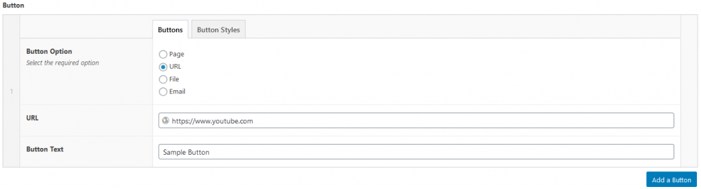
Inside Buttons we have Button Option allows you to choose between Page, URL, File and Email.
Depending on your choice above, you will then be able to choose the target of your button. For example, selecting URL will give you a URL field. Selecting Page will give you a page selector, etc.
Button Text is the text inside the button, for example Learn More, View Details, Watch Now.
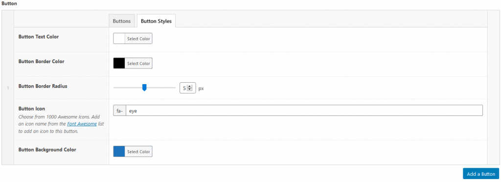
Inside Buttons Styles we have some more options.
Button Text Color allows you to change the color of the button text.
Button Border Color allows you to change the color of the button border.
Button Border Radius allows you to add a curved edge to your buttons. Choose between 0px (no curves) and 10px (curvy).
Button Icon allows you to add an icon to your button. Choose from over 1000 icons from Font Awesome, simply place the name of the icon in the Button Icon field.
Button Background Color allows you to change the background color of the button.
Using the styles set in the above screenshot, combined with a global Button Style of Style 2, the result is this: